Thursday, October 14, 2010

Word’s Trust Center

Every now and then I receive a question about Word that is a bit hard to answer—primarily because I don’t know the answer and secondarily because I have difficulty finding an answer in one of my Word books. Here are a couple of questions that fit into this category:

When making comments, each comment shows the person's name who made the comment, i.e., JD1: Comment. After saving the document, however, it changes to A1: Comment. What’s going on here?

and...

Our reviewers used track changes to make edits to the document and whenever they save the document their comment initials are replaced with an “A.”

Here’s the answer (which required a bit of searching on Internet forums and desktop publishing help groups):

Word’s Trust Center
Removing personal information from the file properties on Save

  1. Click on the Office Button in the upper left corner of the Word window
  2. Click on the Word Options button at the bottom of the drop down window
  3. Click on “Trust Center” in the left navigation menu
  4. Click on the Trust Center Settings button in the lower right corner of the window
  5. Click on “Privacy Options” in the left navigation menu
  6. Under “Document-Specific settings,” uncheck the box next to “Remove personal information from the file preoperties on save”
  7. Click Ok to close this window and Ok again to close the final window

You’re likely to not notice the problem until you save a document, at which point all the initials (from multiple reviewers) will switch to the generic “A.” Don”t worry—you can recover those reviewer initials if you don’t go too much further.

Before adjusting the settings as laid out in the above list, reverse the change to the initials by pressing Ctrl+Z. This will undo the last thing Word did, which was to change those initials. Now that you have returned the initials to the comments, follow the procedure laid out in this post to make sure it doesn’t happen again the next time you save the document.

Friday, October 1, 2010

The Golden Proportion

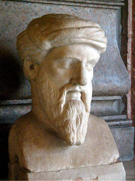
Pythagorus, circa 500 BC

A man living in Samos, Greece, about 2,500 years ago had an amazing ability to recognize mathematical equations in nature and architecture. He formed some principles of aesthetics that have stood the test of time and are still used today. According to Wikipedia, this man “was the first man to call himself a philosopher, or lover of wisdom,[his] ideas exercised a marked influence on Plato, and through him, all of Western philosophy.” His name was Pythagorus, you probably know him by his Pythagorean theorem regarding the three sides of a right triangle (a2 + b2 = c2). That’s him in the picture to the right. And we’re going to talk about how his ideas impact page layout.

When setting up a page layout architecture, many people set a grid to help them align various elements on the page. A derivative of the Golden Proportion or Golden Ratio, the Rule of Thirds forms the basis for many page layout designs. To accomplish the rule of thirds simply draw two vertical lines on the page separating the page into three equidistant parts. If that sounds a little too &lduo;mathy” for you, just split the page into three equal columns. Then place elements in the page based on those column widths. That’s the rule of thirds.

The Golden Proportion is a little more complicated to calculate but is more pleasing to the eye of the reader. In fact, it actually makes the information on the page easier to read.

Of course, you’d probably now like to know what the golden proportion is. This is so powerful that I really thought you needed to know the history behind it. A little knowledge can be dangerous. But now that you know the history:

The Golden Proportion Equation

Divide the width of your page by φ.

See, that wasn’t that hard, was it? Don’t remember that symbol from high school math class? That symbol, if you don’t remember it (as I did not when I first read about the golden proportion), is the symbol for phi, or the symbol for the number 1.6180339.... And that’s a tough one to remember, especially since the numbers after the decimal never end. So let’s simply round it off to 1.62.

Divide the width of your page (that would be the remaining width of the page after you lop off the margins where you won’t be printing) by 1.62. If you’re using a standard 8.5 x 11-inch page with 1-inch margins all around, that leaves you with 6.5 inches of page real estate.

6.5 inches ÷ 1.62 = 4.01

We’ve already rounded our numbers once, so we probably shouldn’t do it again—but I’m going to. I’m going to say four inches instead of 4.01. If we subtract 4" from 6.5" we have a remainder of 2.5", which gives us our golden proportion. Anything that does not fill the full column width of 6.5 inches would be best set to either 4 inches or 2.5 inches. A 2.5-inch callout would be wrapped by a 4-inch wide swath of text.

And that’s how Pythagorus’ architectural principle may be applied to page layout.

I know this was a long a potentially dull topic. But try it in your page designs and see how much it improves the overall look and readability. I think you’re going to be happy with the results.

P.S. – That picture of Pythagorus up in the top right corner is proportioned using this technique. So that’s an example of how it will look on the page.