Monday, November 22, 2010

Increase your monitor real estate

Have you projected Word onto a screen for a team meeting? Have you projected Word using a low resolution projector? Have you noticed that almost nothing fits onto the screen?

Yeah, me too. And I desperately needed more screen size to show more of the document to the team.

Word 2007 introduced “The Ribbon,” a useful but large part of the Word window. Although removing the ribbon will not double the size of the screen real estate, it will provide a tremendous increase.

There are three different ways that you can hide the Word Ribbon:

  1. Click the down arrow to the right of the Quick Access toolbar and select Minimize the Ribbon
  2. Press CTRL + F1
  3. Double click the current tab above the Ribbon

This is a simple but effective way to show more on screen. I hope you find it helpful.

Thursday, November 4, 2010

The importance of design theory

I’ve heard it again and again: Proposal development does not need attention to design. You just need to be able to cram 15 pounds of text into a 1-pound box. Although there is some truth in there, I believe the stringent requirements of proposal development require a greater understanding of design principals and their application than those projects that offer more creative license.

Although the RFP typically does not request an aesthetic page design, proposals that are easier to read are more likely to rise to the top of the consideration pile than the ones that make the reviewers work more difficult. Appropriate and creative application of design principles can result in a far better looking and easier-to-read proposal. And the better looking and easier-to-read proposal is more likely to win the award.

Figure/Ground

When we process visual information—for example, the elements that have been placed on a page—our minds subconsciously look for horizons, lines, structure, and other common visual elements in our physical world. A single horizontal line on a page implies ground. A vertical line implies an object in front of that horizon. This object, in our minds, has weight and would be affected by gravity. As page designers, we are able to cause an unsettled feeling in the reader’s subconscious by haphazard placement of the page elements. If the page is off-balance, the reader will sense the imbalance and will subconsciously sense that something in this proposal is off-kilter.

Positive space (text, callouts, graphics, etc.) must be “aired out” with negative space (white space, areas of the page that contain nothing). Due to the page limitations in most proposals, this is a particularly difficult thing to accomplish in proposal design. But an understanding of this concept will help the designer to prioritize the ways in which he or she will attempt to fit the maximum amount of text onto the page.

The designer who is aware of the visual design aspect on the page will seek to balance the page through careful positioning of text, callouts, and graphics in an effort to provide visual relief from the potential sea of gray text. Well positioned graphics will break up the text, giving the reader’s eyes a break as he scans the page. This, in turn, provides an subconscious impression that there is air (white space), even when that white space is at a minimum due to the page limitations.

Some tools to keep in mind

  • Work on visual symmetry in each proposal page. When creativity is constrained and textual real estate is at a premium, visual symmetry is one of the best ways to bring balance and airiness to the page.
  • Try to place larger, margin-to-margin graphics low on the page. This provides a visual foundation to the page so the reader is not unsettled by what appears to be a heavy object floating in mid-air, against the forces of gravity.
  • Carefully choose the color and style of callouts in a way that help to balance the weight of the elements on the page. Remember: darker elements give an impression of greater weight than lighter elements. So a large light-colored elements may be balanced by a smaller dark-colored element.
  • Maintain acceptable spacing. Don’t give into the temptation to remove all cell padding from tables and all spacing between paragraphs. If leading and paragraph spacing become too tight, the document becomes difficult to read. At the least, the reviewer will sense that this proposal is causing him extra work. But the more astute reviewer may realize that the submitting contractor is trying to cram way more onto the page than they should. This will raise a red flag in the reviewer’s mind and may be used as a mark against the company who submitted that proposal.

Many of these suggestions require some interpretation and a balance against the needs of the proposal writers. That’s the reason you’re the designer. You get to make those life-shattering decisions.

Have fun. Be creative. This is a great job!

Thursday, October 14, 2010

Word’s Trust Center

Every now and then I receive a question about Word that is a bit hard to answer—primarily because I don’t know the answer and secondarily because I have difficulty finding an answer in one of my Word books. Here are a couple of questions that fit into this category:

When making comments, each comment shows the person's name who made the comment, i.e., JD1: Comment. After saving the document, however, it changes to A1: Comment. What’s going on here?

and...

Our reviewers used track changes to make edits to the document and whenever they save the document their comment initials are replaced with an “A.”

Here’s the answer (which required a bit of searching on Internet forums and desktop publishing help groups):

Word’s Trust Center
Removing personal information from the file properties on Save

  1. Click on the Office Button in the upper left corner of the Word window
  2. Click on the Word Options button at the bottom of the drop down window
  3. Click on “Trust Center” in the left navigation menu
  4. Click on the Trust Center Settings button in the lower right corner of the window
  5. Click on “Privacy Options” in the left navigation menu
  6. Under “Document-Specific settings,” uncheck the box next to “Remove personal information from the file preoperties on save”
  7. Click Ok to close this window and Ok again to close the final window

You’re likely to not notice the problem until you save a document, at which point all the initials (from multiple reviewers) will switch to the generic “A.” Don”t worry—you can recover those reviewer initials if you don’t go too much further.

Before adjusting the settings as laid out in the above list, reverse the change to the initials by pressing Ctrl+Z. This will undo the last thing Word did, which was to change those initials. Now that you have returned the initials to the comments, follow the procedure laid out in this post to make sure it doesn’t happen again the next time you save the document.

Friday, October 1, 2010

The Golden Proportion

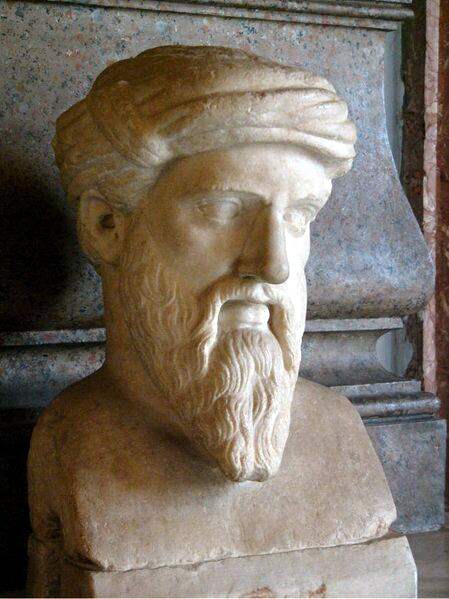
Pythagorus, circa 500 BC

A man living in Samos, Greece, about 2,500 years ago had an amazing ability to recognize mathematical equations in nature and architecture. He formed some principles of aesthetics that have stood the test of time and are still used today. According to Wikipedia, this man “was the first man to call himself a philosopher, or lover of wisdom,[his] ideas exercised a marked influence on Plato, and through him, all of Western philosophy.” His name was Pythagorus, you probably know him by his Pythagorean theorem regarding the three sides of a right triangle (a2 + b2 = c2). That’s him in the picture to the right. And we’re going to talk about how his ideas impact page layout.

When setting up a page layout architecture, many people set a grid to help them align various elements on the page. A derivative of the Golden Proportion or Golden Ratio, the Rule of Thirds forms the basis for many page layout designs. To accomplish the rule of thirds simply draw two vertical lines on the page separating the page into three equidistant parts. If that sounds a little too &lduo;mathy” for you, just split the page into three equal columns. Then place elements in the page based on those column widths. That’s the rule of thirds.

The Golden Proportion is a little more complicated to calculate but is more pleasing to the eye of the reader. In fact, it actually makes the information on the page easier to read.

Of course, you’d probably now like to know what the golden proportion is. This is so powerful that I really thought you needed to know the history behind it. A little knowledge can be dangerous. But now that you know the history:

The Golden Proportion Equation

Divide the width of your page by φ.

See, that wasn’t that hard, was it? Don’t remember that symbol from high school math class? That symbol, if you don’t remember it (as I did not when I first read about the golden proportion), is the symbol for phi, or the symbol for the number 1.6180339.... And that’s a tough one to remember, especially since the numbers after the decimal never end. So let’s simply round it off to 1.62.

Divide the width of your page (that would be the remaining width of the page after you lop off the margins where you won’t be printing) by 1.62. If you’re using a standard 8.5 x 11-inch page with 1-inch margins all around, that leaves you with 6.5 inches of page real estate.

6.5 inches ÷ 1.62 = 4.01

We’ve already rounded our numbers once, so we probably shouldn’t do it again—but I’m going to. I’m going to say four inches instead of 4.01. If we subtract 4" from 6.5" we have a remainder of 2.5", which gives us our golden proportion. Anything that does not fill the full column width of 6.5 inches would be best set to either 4 inches or 2.5 inches. A 2.5-inch callout would be wrapped by a 4-inch wide swath of text.

And that’s how Pythagorus’ architectural principle may be applied to page layout.

I know this was a long a potentially dull topic. But try it in your page designs and see how much it improves the overall look and readability. I think you’re going to be happy with the results.

P.S. – That picture of Pythagorus up in the top right corner is proportioned using this technique. So that’s an example of how it will look on the page.

Thursday, September 30, 2010

What is a Word template?

The word template causes more confusion than most desktop publishers would like to admit. To add to the confusion, Microsoft has chosen to use template files to hold macros, scripting, and other utilities that cannot be contained in a document.

Definition

According to the Oxford English Dictionary, a template is:

A preset format for a document or file, used so that the format does not have to be recreated each time it is used:
a memo template

What a template is

The OED definition comes pretty close to explaining the basic purpose of a template—both within the MS Word universe and in the real world. But in Microsoft Word the template has a broader meaning—and it is much more technical in nature compared to the simple document skeleton most people think of when they hear the word template.

Typically Word’s templates are stored in a completely different location from the documents. The template file is used to create new documents and it provides a variety of time-saving devices to speed the document creation process. The Word template may or may not include added specialized functionality—depending primarily on how much attention to detail and usability the template designer applied when setting up the template.

What does Microsoft mean when they say “template”?

Microsoft templates often contain content, but that is truly not the purpose of a template. Templates provide structure, formatting, and layout to the documents they will create. Page size, margins, orientation, number and width of columns, font types and colors, etc., are determined by the template file. The template may also contain features that speed efficiency and consistency through the application of styles and use of various galleries and toolbars. A template may contain boilerplate text, such as legal statements, disclaimers, and copyrights. The boilerplate may be intended for use “as-is,” or it may be a launching pad providing ideas to the document writer—ideas that will be re-written as necessary. Other than a few paragraphs of boilerplate text, however, most of the text in a typical document is provided by the writer of that document.

Word templates leverage use of macros, auto-text, Building Blocks, customized toolbars, keyboard shortcuts, and scripts to increase the efficiency and capabilities of the desktop publisher. And these are the features of the Word template that a) require that the document be attached to the template, and b) make Word template far more powerful than most people realize.

This post is intended to just barely scratch the surface of template definition. I will post further articles soon that dig a little deeper into the functionality and capabilities of Microsoft Word templates.

Tuesday, September 28, 2010

New Direction

Ch.. ch.. ch.. Changes!

The Deloitte Federal Capture Group has chosen a different template as the standard so this blog will take a different direction. At this point I’m planning to discuss some template creation techniques and desktop publishing best practices. But I may not have enough inspiration to post regularly, so please send in questions, ideas, complaints, humorous stories, abuse, praise, and delusional rants. Well... maybe not all of the above. Just chose one or two and send ’em in.

Thanks. And let me know how things are going with this blog. I want to make this as useful as possible.

Thursday, September 23, 2010

Brand compliant

Big Changes!

The branding gurus in Atlanta DCS have perused the Federal Proposal template and given their feedback. So – there are quite a few changes and we are now fully brand compliant.

I’ll wait for the applause to die down before I continue...

Let’s get to it. Here are some of the most prominent changes:

Branded Tables

I have adjusted the tables to match the table presentation on Brand Space. So they now look like this:

Table Heading Table Heading Table Heading
Table Body Table Body Table Body


Branded Callouts

Callout heading
Per branding, the border is set to 1.5 points with a matching color heading. The template contains three different color callouts in this style.

The Federal Proposal template now contains five different callouts, all found in the Quick Tables Gallery (Insert>Tables>Quick Tables). The first three callouts are variants of the callout shown to the right. Callout4 is a different type of callout, with a solid background color. Solid color callouts must bleed off the side of the page.

The final callout in the Federal Proposal template is a text-only callout set to the medium blue color from the standard Deloitte color palette.

Fonts and new toolbar buttons

Body text has been adjusted to match the Deloitte brand standard for body text, which is 9.5 pt. Arial. As a standard Deloitte template, the fonts have been set to begin at brand standard. But because all federal proposals must be RFP compliant, and because a high percentage of our RFPs call for Times New Roman copy, I have added two new buttons to the Federal Proposal template Quick Access toolbar (seen below).

The Times New Roman button will change all text in the document to Times New Roman (minimum 12-point font size) and the Reset Fonts button will switch everything back, just in case you clicked the first button by accident.

Friday, September 10, 2010

Quick Tables Gallery in the federal proposal template

On Laura Caldwell’s (Tampa) request, here is a list of the items in

The Federal Proposal Template’s Quick Tables Gallery

Word 2007’s Quick Tables Gallery provides a convenient way to insert pre-formatted tables. In the Federal Proposal template, a new group has been added to the gallery. You’ll find this new “Deloitte Federal” at the bottom of the list, below Word’s standard quick tables.

On the “Insert” tab of the Ribbon, in the “Tables group, click on the small downward facing arrow under Table. Choose Quick Tables and scroll down to the “Deloitte Federal” group. The Deloitte Federal group of Quick tables includes the following tables:

Deloitte Federal Quick Tables


Callout1

Table Heading
This text is set to Callout Body style. A Callout Bullet style is also available.

Callout1 is actually a table within a table. The interior table is what you see—with the blue heading and the white lower portion containing the main callout text. The surrounding table is a single cell table with white borders, rendering it invisible in print. The single cell surrounding table is set for the row to not break over pages, which keeps the callout together on one page. It’s a cumbersome trick, but it keeps Word from putting the heading of the callout on one page and the body on the next page.

Be careful when moving a callout. Dragging and dropping is not recommended. If you drag the callout, you will likely drag only the interior table and not the surrounding invisible table. To make small adjustments in positioning, position your cursor to the right of the callout. With the hidden characters turned on you can position your cursor just inside the small box to the right of the callout. This will select the outer table. Then use the positioning in the table properties to make your adjustments.

Callout2

Callout2 is a standard Deloitte callout that was introduced in some of the branding training during the current brand standard rollout. Federal Proposals are typically page limited and have very little available excess space, which means that this callout is seldom used.

Callout text goes here. Recommended widths for callout: 4.06 inches or 2.4 inches.

But on the rare occasion when you are able to set a callout in this format, it provides a pleasant breakup in the overall page layout and brings some uniqueness to the document. The recommended widths are based on the “Golden Ratio” or “Golden Proportion” and have been included in this automation for those who are less familiar with aesthetics and design. As designers, you should use a width that suits the ultimate page layout.

Table1

Figure 1.1-1. Provide Title.

Action caption, if needed.

Table Heading Table Heading Table Heading Table Heading
Table Body Table Body Table Body Table Body


Table2

Figure 1.1-1. Provide Title.

Action caption, if needed.

Table Heading Table Heading Table Heading Table Heading
Table Row Head Table Body Table Body Table Body


Table3

Figure 1.1-1. Provide Title.

Action caption, if needed.

Table Heading Table Heading Table Heading Table Heading
Table Body Table Body Table Body Table Body

Template Update - Logo resizing

Teri Fleming’s team in Atlanta noticed that the logos in the template had been resized disproportionately. On their recommendation, this has been fixed.

Thanks, Teri Fleming (Atlanta)!

Wednesday, September 8, 2010

Keyboard shortcuts in the Federal Proposal template

I am a firm believer in using keyboard shortcuts. After a short learning curve (committing the keyboard shortcuts to memory), your efficiency will increase so much that you will soon forget about the time it took to learn the shortcuts in the first place.

I have not fully developed the keyboard shortcuts in the Federal Proposal template yet, but I have made a start and thought I should share these with you. Please contact me with any suggested shortcuts that you think may help increase our efficiency or make it easier to work in proposal documents.

Keyboard Shortcuts

Keystroke Resulting Action
Ctrl+B Applies Character Bold style
Ctrl+I Applies Character Italics style
Ctrl+U Applies Character Underline style
Ctrl+Shift+B Applies Character Bold Blue style
Alt+Ctrl+1 Applies Heading 1 style
Alt+Ctrl+2 Applies Heading 2 style
Alt+Ctrl+3 Applies Heading 3 style
Alt+Ctrl+4 Applies Heading 4 style
Alt+Ctrl+5 Applies Heading 5 style
Alt+Ctrl+6 Applies Heading 6 style
Alt+Ctrl+7 Applies Heading 7 style
Alt+Ctrl+8 Applies Heading 8 style
Alt+Ctrl+9 Applies Heading 9 style
Alt+Ctrl+B Applies Body Text style
Alt+Ctrl+Shift+B Applies Body Text (keep with next) style
Alt+Ctrl+Shift+Right Sets table width to 100%
Ctrl+Spacebar Removes formatting from selection
Alt+Ctrl+Shift+D Creates a new document from the selection
Ctrl+Shift+F9 Unlinks selected field
F9 Updates selected field

Monday, August 30, 2010

How to unlink a TOC

I am often asked how to unlink a Table of Contents. The technique for unlinking a Table of Contents may also be used to unlink any field and is, therefore, a very useful technique to remember and to keep handy.

How do I unlink a Table of Contents?

To unlink any field in a Word document, select the field and then press the keyboard combination Ctrl+Shift+F9

That’s it.

Monday, August 23, 2010

Typography

Some questions seem to come up again and again. This post will address one such recurring question:

What font size should we use if the RFP calls for a font of X-pitch?

or the equivalent question:

What font size should we use if the RFP says to use a font with no more than X characters per inch?

This question arises somewhat regularly, but not often enough for most of us to remember the results of the last time we researched this question. So here it is:


Typographic Terminology

There are several methods typographers can use to measure character spacing (kerning) and line spacing (leading). Listed below are the definitions, and typical conversions you might need to employ.

Point

“Point” is a unit of measurement used in typography that is equal to 1/72-inch. It is used primarily for representing the height of characters and the amount of space between lines, also known as leading.

Pitch Transferred to Points

120/Pitch = Points

For example: 12 Pitch = 120/12 = 10 Points

Pica

“Pica” refers to a unit of measurement equal to 1/6 of an inch or 12 points. Pica and points can be used interchangeably and many typographers use pica as their standard unit of measurement.

Points Transferred to Pica

Points/12 = Pica

For example: 24 Points = 24 Points/12 = 2 Pica

Pitch

“Pitch” describes the width of a character. Pitch equals the number of characters that can fit side-by-side in 1 inch; for example, 10 pitch equals 10 characters-per-inch or 10 CPI. Pitch is a term generally used with non-proportional (fixed-width) fonts.

Point Transferred to Pitch

120/Points = Pitch

For example: 10 point = 120/10 = 12 Pitch

Twip

“Twip” is a unit of measurement equal to 1/20th of a printers point. There are 1440 twips to and inch, 567 twips to a centimeter.

Points Transferred to Twips

20*Points = Twips

For example: 10 Points = 20*10 Points = 200 Twips


For those who would like a bit more information than most of us, the following explains some of the difficulties that have arisen with these odd words.

Typographic Dinosaurs

First, the term pitch and its equivalent characters per inch are typographical holdovers from the days of fixed-width fonts and typeset printing. We still use other terms from that bygone era including the term leading, which refers to the amount of space between each line of text.

In old-fashioned typesetting a line of text was separated from the lines surrounding it by small pieces of lead that were inserted between the lines. Thus, the term leading.

Advanced typesetting used variable-width fonts and the typesetters adjusted the spacing between those characters with the same small pieces of lead. This was called kerning (between two characters) and tracking (between all the characters in a full line of text). But most people did not have access to this advanced typesetting and had to rely on typewriters, which used fixed-width fonts. Each character in a fixed-width font (such as Courier font) is exactly the same width as all the other characters. When communicating the desired kerning or tracking, the publisher would instruct the typesetter to use a particular pitch, which referred to the number of characters per inch. So, for example, the manager would tell the typesetter, “Please set this to 12-pitch” when he wanted no more than 12 characters per inch.

Fixed-width fonts are a thing of the past, but the term has survived and pops up from time to time in RFPs.

Wednesday, August 18, 2010

Bullet Intro

By popular request, a new style (Bullet Intro) has been added to the Federal Proposal template. This style should be used prior to a bulleted list. The space after this paragraph is set to 6 points rather than the standard 9 points. This will visually prepare the reader for the tighter bulleted list spacing. An example follows:

Here’s a standard paragraph with a whole lot of text in it. This has been presented to show the amount of space that exists under a standard paragraph. This paragraph has been set in Body Text style.

This paragraph will introduce bullets and the spacing has been reduced slightly to allow the bullets to flow more from the paragraph. This paragraph has been set in Bullet Intro style.

  • This is the first bullet (Bullet 1 style)
  • This is the next bullet in the list
  • This is the penultimate bullet
  • This is the final bullet with Bullet 1_Last style applied to increase the spacing in order to prepare for the next paragraph, which will be set to Body Text.

This is a standard paragraph (Body Text) again. It will return the flow of the document to standard spacing, which is 9 points between each paragraph.

This paragraph is intended to show the spacing relative to the previous “Body Text” paragraph. This paragraph is set to “Body Text” as well.

Tuesday, August 17, 2010

Federal Proposal Template Update

Updates – August 17, 2010

  • Adjusted bullet levels 1 and 3 to show black bullets instead of blue.
  • Added Bullet Intro style
    Bullet Intro should be applied to the paragraph prior to a bulleted list. It has a reduced space after the paragraph (6 points instead of the standard 9 points).

Wednesday, August 11, 2010

Collaborating by design

Three years ago I determined to set up a blog for the Deloitte Federal desk top publishers. At the time, we had a handful of contractors performing desk top publishing duties and one full-time Deloitte employee—me. I began to set up the blog and prepare a list of applicable topics of discussion. Then Deloitte decided to discontinue all contracts for support services in Federal proposal development. Employment offers followed; some designers chose to stay; all desk top publishers left.

End of blog concept.

We now have quite a few desk top publishers here on staff and are actively hiring new desk top publishers, designers, coordinators, and more. So I think it’s time to revive the idea.

We have an amazing amount of talent grouped together here in the Deloitte Federal Capture Group, but we don’t often have the opportunity to share our knowledge and skills with each other. Time constraints, compliance requirements, training—many things keep us from taking the time to share with and learn from one another. This newsletter and the parallel blog will be an attempt to overcome those things that get in the way of our collaboration.

We’ll all need to work together to accomplish this goal. So when you’re working on a proposal and you figure out a technique that is helpful, write it down. When you’re reading a book or taking a course and learn a new method, write it down. Then submit those things you have written down for use in upcoming newsletters and blog posts. Let’s work together to make the Deloitte Federal Capture Desk Top Publishing Corps. the best page layout & design group in the marketplace. Send your ideas to Rich Gelina. And thank you for your help as we push forward toward excellence.